[

Chivas Regal

]

Translating the 'Clashing Forces' identity into a rule-breaking digital experience.

Role

Senior UI Designer

Scope

UI/UX, Responsive Website, Design System

Duration

4 months

Results

Live at chivas.com · 260+ component library co-created · Global e-commerce rollout

Live at chivas.com · component library co-created · Global e-commerce rollout

SUMMARY

Chivas Regal faced an existential threat: irrelevance. Seen as a "Dad’s drink," it was losing ground to modern spirits. To stay relevant, the brand pivoted to a new "Clashing Forces" identity.

On the global rebrand, I owned the responsive layout system and the site's motion language, working alongside the Lead Designer and the wider product team. My job was the hard translation: taking a chaotic print identity and writing the rules that let it ship as usable, global e-commerce.

My key contributions

  • Visual System: Converted a complex, print-focused style guide into a responsive web interface.


  • Layout Design: Created editorial-style layouts that broke the grid to reflect the brand’s rebellious attitude.

  • Motion Prototyping: Animated interactions to bring static brand elements to life, defining the site’s motion language.


  • Campaign Assets: Designed digital assets for the “Success is a Blend” campaign, maintaining visual consistency across all touchpoints.

Strategic Context

The "Dad's Drink" Dilemma

Chivas faced an aging audience and a digital presence too safe to compete with streetwear culture. Our challenge was to bring the chaotic “Clashing Forces” art direction to life, balancing the visual energy needed to engage Gen Z with the usability required for a global e-commerce platform.

Creative Direction

Controlled Chaos

How do you break the grid without breaking usability? Chivas wanted chaos; e-commerce needs order.

We didn’t tame the identity, we systematised it. Moving beyond standard grids, I turned the Controlled Chaos vision into rules the whole team could design with, across key journeys. Aggressive typography paired with elegant serifs created visual tension, capturing attention while keeping the energy intuitive enough to drive global conversion.

Impact & ROI

The rebrand and digital overhaul were key in transforming Chivas from a dusty bottle into a modern lifestyle brand.

Commercial Context

The rebrand launched into a period where Chivas grew net sales 25% and became Pernod Ricard's top growth contributor. My part: the responsive web experience that carried 'Clashing Forces' to a global audience."

The rebrand launched into a period where Chivas grew net sales 25% and became Pernod Ricard's top growth contributor. My part: the responsive web experience that carried 'Clashing Forces' to a global audience."

The rebrand launched into a period where Chivas grew net sales 25% and became Pernod Ricard's top growth contributor. My part: the responsive web experience that carried 'Clashing Forces' to a global audience."

Brand Perception

Successfully shed the "Dad's drink" label, repositioning Chivas as a credible player in the streetwear space.

System Adoption

The component library became the shared language between brand, product and regional teams, keeping one identity across markets.

Exploration by Design

The layouts rewarded scrolling and discovery, turning transactional visits into time inside the brand world.

Design Execution

DEFINING "THE CLASH"

To bridge historic prestige with “drop culture,” we turned the chaotic print identity into a dynamic digital system. Drawing on luxury streetwear principles, we moved beyond the grid to focus on visual tension.

The rules of chaos

Rule-breaking only works if the rules are written down. These were ours:
Headlines may crop and collide; body copy and prices never do.

  • Images may overlap anything except interactive elements.

  • The grid always exists; breaking it is a defined exception with set offsets, not a free-for-all.

  • Visual intensity drops as purchase intent rises: full chaos on brand pages, restraint in the funnel.

  • Motion is user-triggered; the visitor conducts the clash, the site never performs it at them.

Breaking the Grid

I created editorial layouts with overlapping images and aggressively cropped headlines. This captured the campaign’s rebellious energy while maintaining a clear spatial system for responsive design.

Texture & Depth

Rejecting flat design, we added rich textures to UI components to reflect the liquid’s premium quality.

Scroll-Triggered "Chaos"

We built a reactive system where visual elements dynamically appear and overlap as the user scrolls. This gave users control over the “clash,” making the experience active rather than passive.
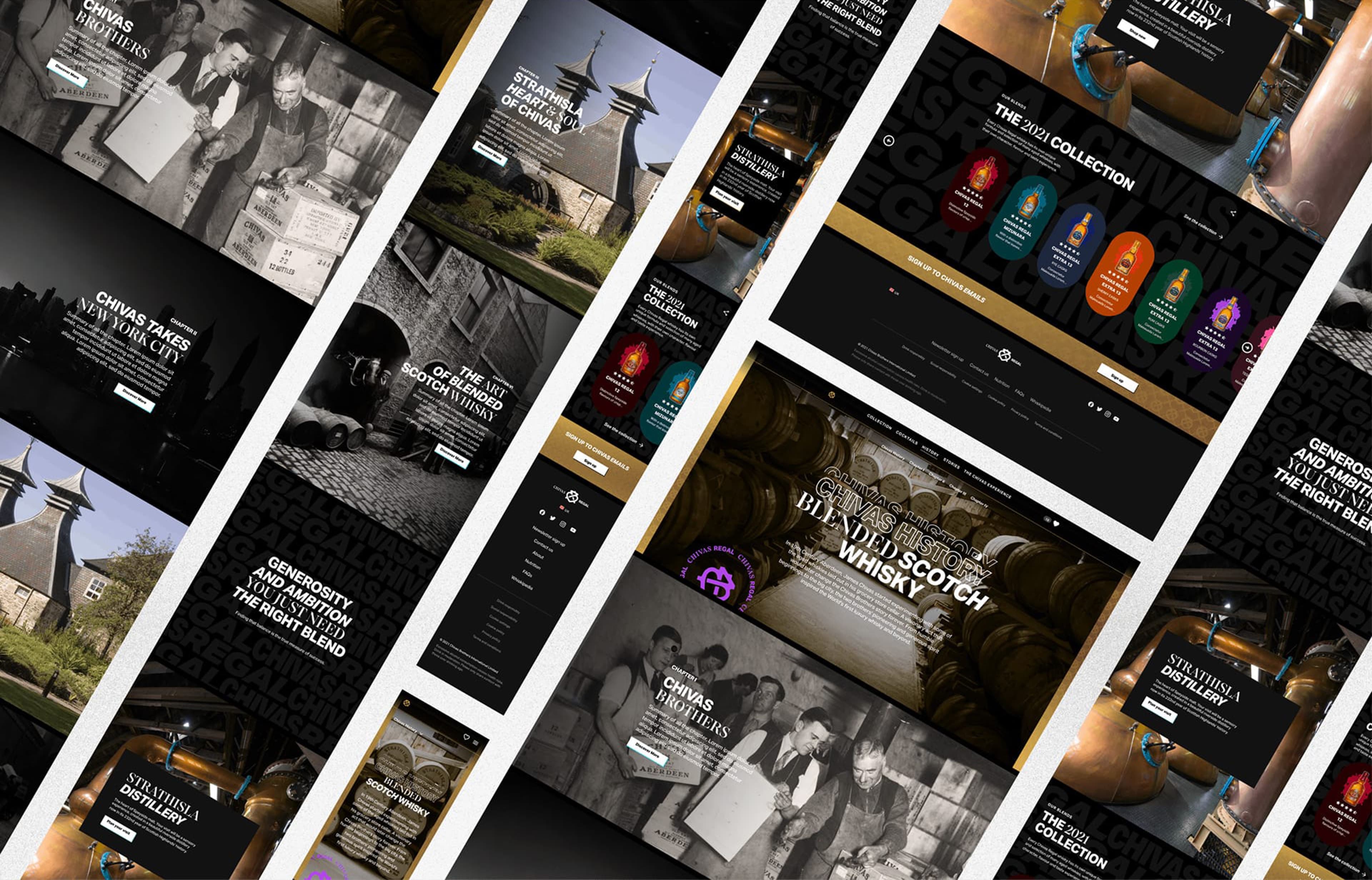
A collage of high-fidelity UI screens for the Chivas Regal website refresh, showcasing the responsive layout and the premium black and gold design system.
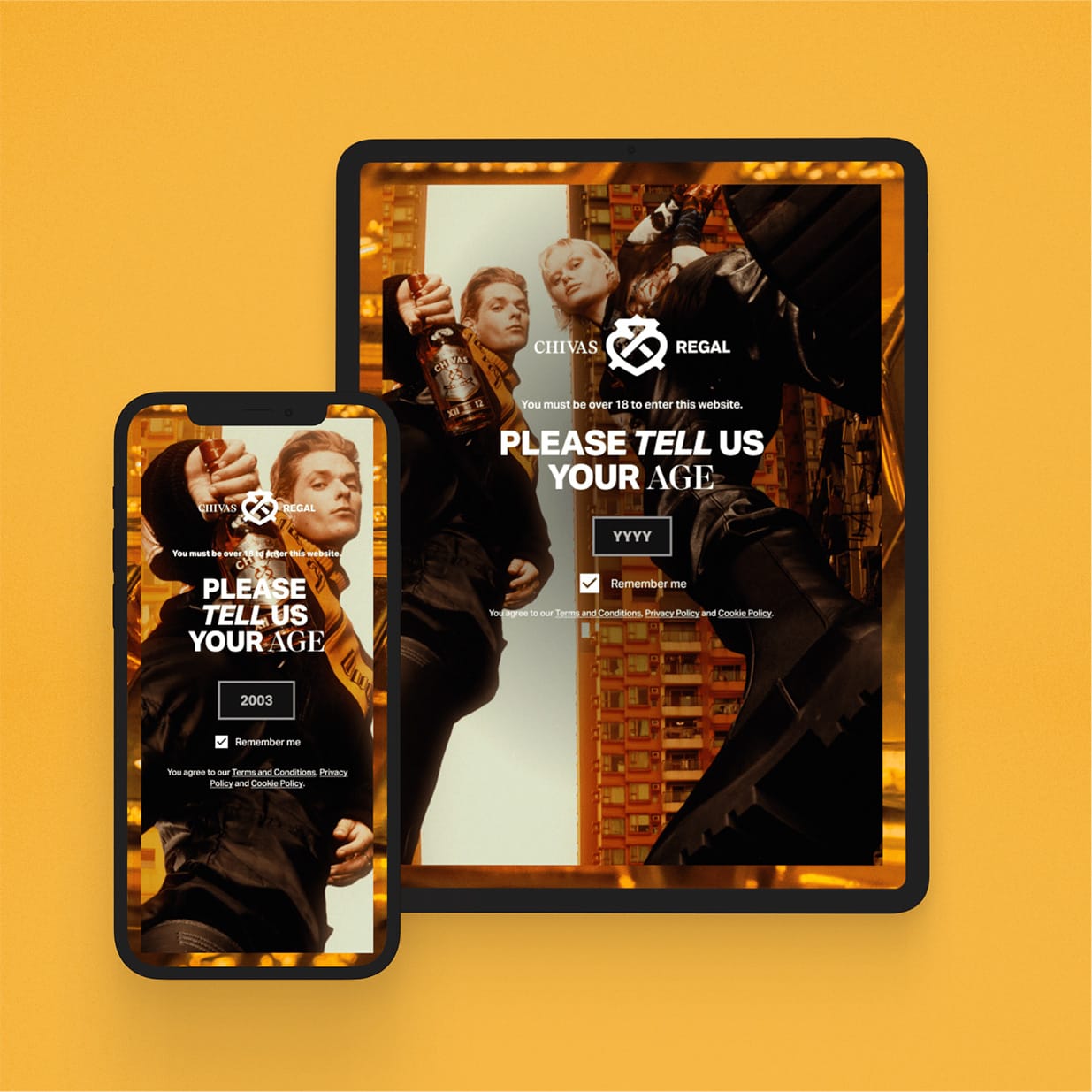
Mobile-first age verification interface designed with high contrast on a vibrant yellow background to optimize the user entry flow.
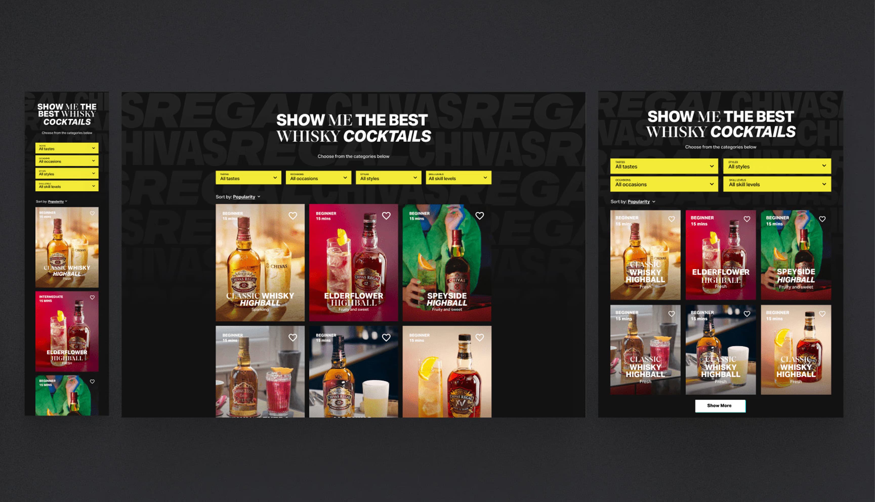
Interactive 'Cocktail Finder' UI featuring a visual grid of whisky recipes with filtering categories like 'Refresh' and 'Summer'.
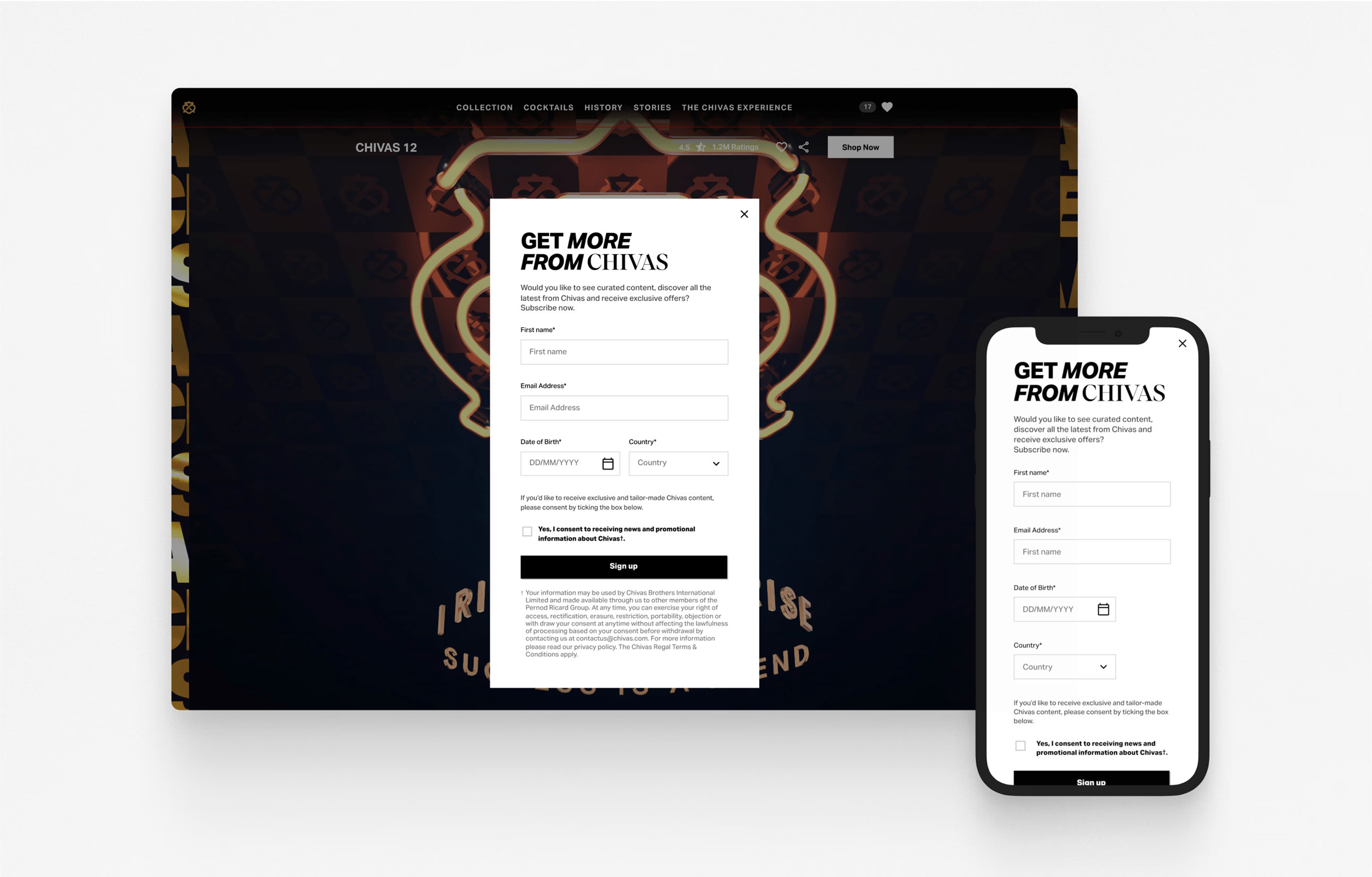
Responsive newsletter sign-up form design ('Get More From Chivas') displayed side-by-side on desktop and mobile viewports.
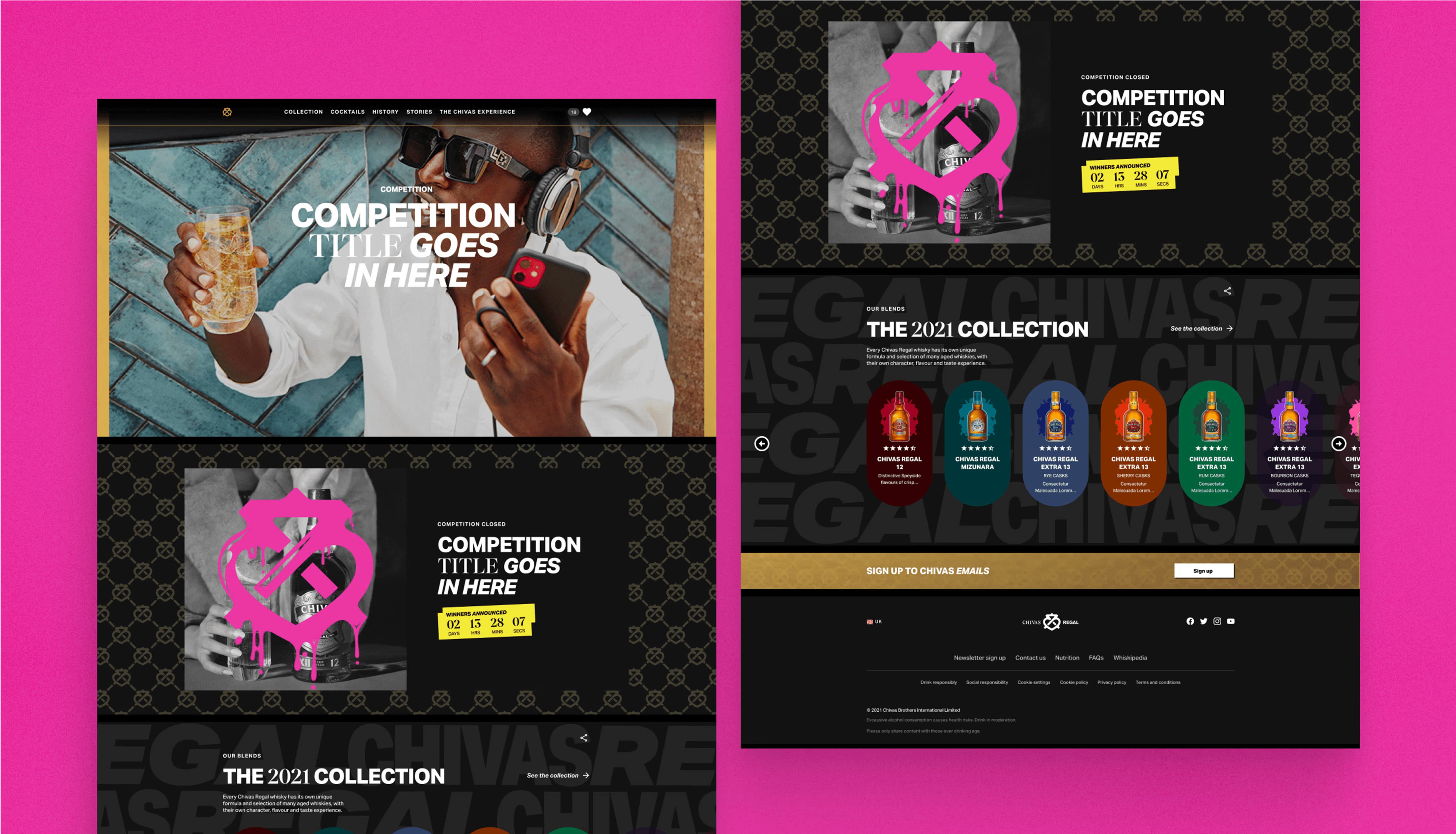
Split-screen UI layout showcasing campaign visuals: a lifestyle shot on a pink background alongside the '2021 Collection' product grid on black.
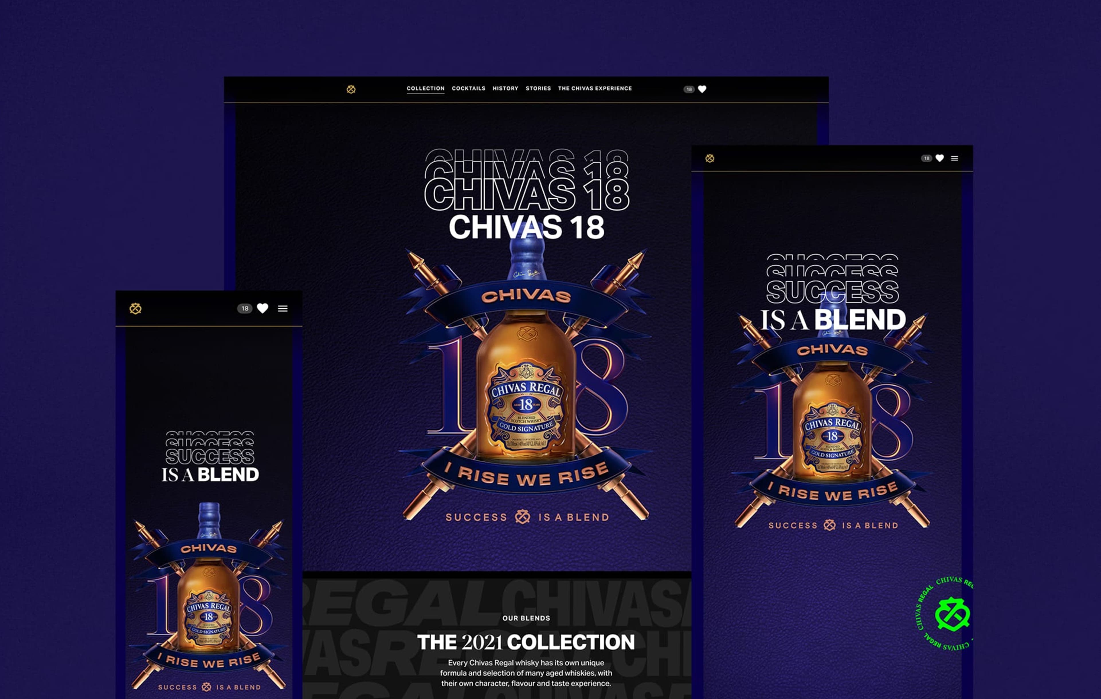
Chivas 18 'Success is a Blend' campaign landing page design displayed on desktop and mobile, featuring the signature royal blue brand palette.
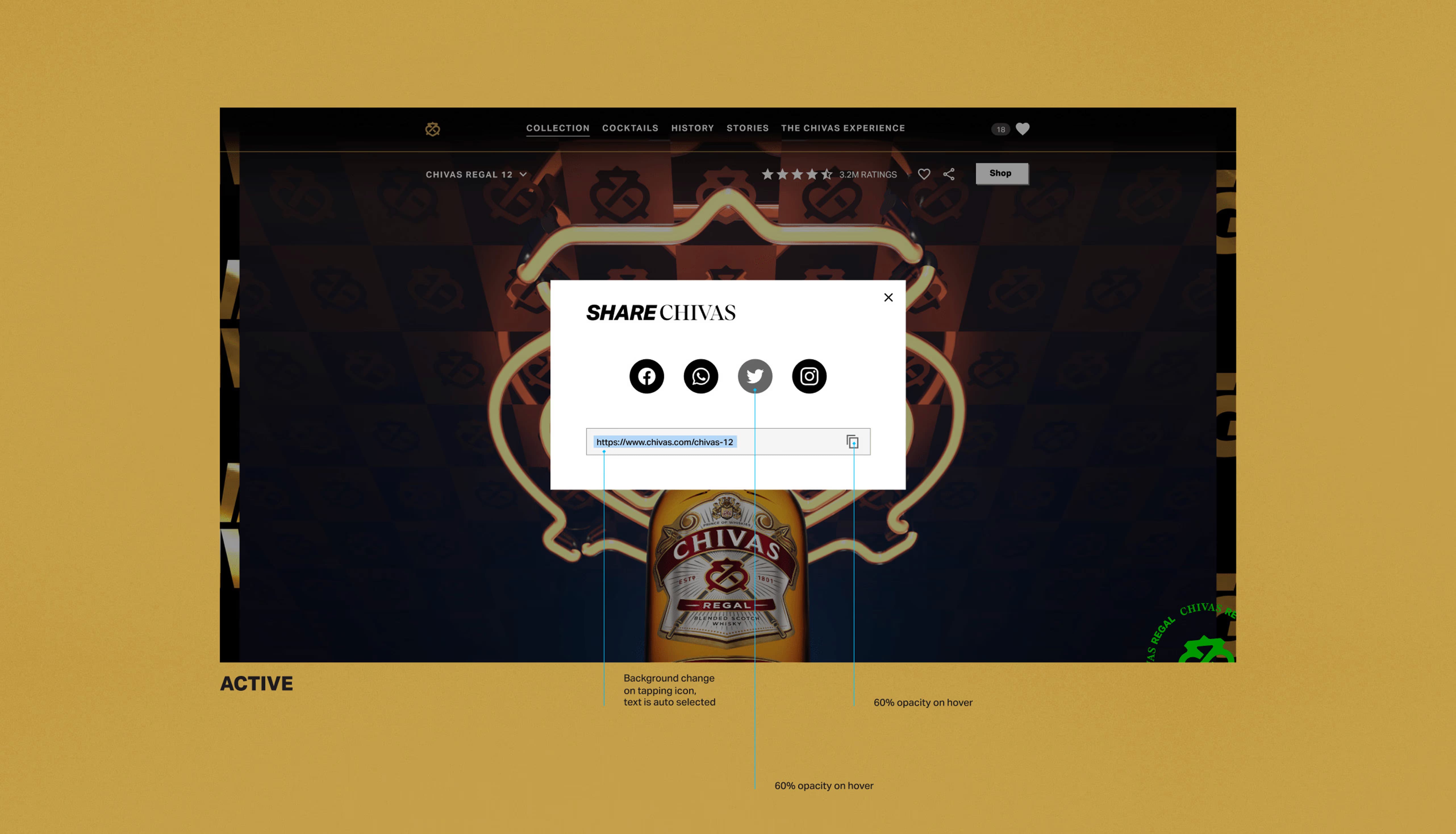
Chivas Regal website age verification modal and social sharing UI overlaid on a premium gold background.
Interactive 'Cocktail Finder' UI featuring a visual grid of whisky recipes with filtering categories like 'Refresh' and 'Summer'.
Chivas 18 'Success is a Blend' campaign landing page design displayed on desktop and mobile, featuring the signature royal blue brand palette.
Mobile-first age verification interface designed with high contrast on a vibrant yellow background to optimize the user entry flow.
Split-screen UI layout showcasing campaign visuals: a lifestyle shot on a pink background alongside the '2021 Collection' product grid on black.
Responsive newsletter sign-up form design ('Get More From Chivas') displayed side-by-side on desktop and mobile viewports.
A collage of high-fidelity UI screens for the Chivas Regal website refresh, showcasing the responsive layout and the premium black and gold design system.
Chivas Regal website age verification modal and social sharing UI overlaid on a premium gold background.
Mobile-first age verification interface designed with high contrast on a vibrant yellow background to optimize the user entry flow.
Interactive 'Cocktail Finder' UI featuring a visual grid of whisky recipes with filtering categories like 'Refresh' and 'Summer'.
Responsive newsletter sign-up form design ('Get More From Chivas') displayed side-by-side on desktop and mobile viewports.
Split-screen UI layout showcasing campaign visuals: a lifestyle shot on a pink background alongside the '2021 Collection' product grid on black.
A collage of high-fidelity UI screens for the Chivas Regal website refresh, showcasing the responsive layout and the premium black and gold design system.
Chivas 18 'Success is a Blend' campaign landing page design displayed on desktop and mobile, featuring the signature royal blue brand palette.
Chivas Regal website age verification modal and social sharing UI overlaid on a premium gold background.
Interactive 'Cocktail Finder' UI featuring a visual grid of whisky recipes with filtering categories like 'Refresh' and 'Summer'.
Chivas 18 'Success is a Blend' campaign landing page design displayed on desktop and mobile, featuring the signature royal blue brand palette.
Mobile-first age verification interface designed with high contrast on a vibrant yellow background to optimize the user entry flow.
Split-screen UI layout showcasing campaign visuals: a lifestyle shot on a pink background alongside the '2021 Collection' product grid on black.
Responsive newsletter sign-up form design ('Get More From Chivas') displayed side-by-side on desktop and mobile viewports.
A collage of high-fidelity UI screens for the Chivas Regal website refresh, showcasing the responsive layout and the premium black and gold design system.
Chivas Regal website age verification modal and social sharing UI overlaid on a premium gold background.
Mobile-first age verification interface designed with high contrast on a vibrant yellow background to optimize the user entry flow.
Interactive 'Cocktail Finder' UI featuring a visual grid of whisky recipes with filtering categories like 'Refresh' and 'Summer'.
Responsive newsletter sign-up form design ('Get More From Chivas') displayed side-by-side on desktop and mobile viewports.
Split-screen UI layout showcasing campaign visuals: a lifestyle shot on a pink background alongside the '2021 Collection' product grid on black.
A collage of high-fidelity UI screens for the Chivas Regal website refresh, showcasing the responsive layout and the premium black and gold design system.
Chivas 18 'Success is a Blend' campaign landing page design displayed on desktop and mobile, featuring the signature royal blue brand palette.
Chivas Regal website age verification modal and social sharing UI overlaid on a premium gold background.

Systematising the Chaos

CONCLUSION

REFLECTIONS

This project showed that UX doesn’t always have to be minimalist. Sometimes it can be loud, textured, and bold. By bringing the “Clashing Forces” concept to life, we reconnected Chivas with a new generation.

Learnings & Future Roadmap

I learned that balancing the “Clashing Forces” aesthetic with usability was a constant negotiation. High-energy visuals engage users but can overwhelm them during functional tasks.

For future iterations, I would explore:

  • Adaptive UI Intensity: Reducing visual noise during checkout flows

  • AI Flavour Visualisation: Personalising education based on user taste

  • WebGL Motion: Optimising collision physics for lower-end devices
© Other projects プロジェクト

[W_RXS®]

Case Studies

© Other projects プロジェクト

[W_RXS®]

Case Studies

© Other projects プロジェクト

Case Studies