PRODUCT / UX DESIGN - NAVIGATION & IA

Giving legal content a home

Giving legal content a home

Giving legal content a home

A company’s policy pages had nowhere to live. They were just footer links to orphaned pages. I gave the whole set a home: one navigation component that keeps you oriented and lets you browse every document, and it holds up all the way from an 1800px desktop down to a 360px phone.

A company’s policy pages had nowhere to live. They were just footer links to orphaned pages. I gave the whole set a home: one navigation component that keeps you oriented and lets you browse every document, and it holds up all the way from an 1800px desktop down to a 360px phone.

A company’s policy pages had nowhere to live. They were just footer links to orphaned pages. I gave the whole set a home: one navigation component that keeps you oriented and lets you browse every document, and it holds up all the way from an 1800px desktop down to a 360px phone.

A walkthrough of the redesigned Company hub. The sidebar drives navigation across the whole policy set. Brand, logo, colours and registration details are anonymised.

TIMEFRAME

March to April 2026

RESULTS

Find-a-policy time cut from 109s to 47s · Task success 6 of 8, up from 3 of 7 · One component, 1800px to 360px

ROLE

Product / UX Designer

RESPONSIBILITIES

• Reframed eight orphaned policy pages as a single navigable set

• Designed the desktop hub: an overview landing page and a persistent grouped rail

• Built the navigation as one component with defined states from the desktop down to a 360px phone

• Explored three patterns for the smallest state and specified the winner for hand-off

• Kept every decision inside the existing design-system tokens

THE GOAL

Give a documentation-heavy section a single, coherent home.

Give a documentation-heavy section a single, coherent home.

Give a documentation-heavy section a single, coherent home.

One that tells you where you are, lets you browse the whole set, costs almost no screen, and holds up from the desktop down to the smallest phone.

One that tells you where you are, lets you browse the whole set, costs almost no screen, and holds up from the desktop down to the smallest phone.

One that tells you where you are, lets you browse the whole set, costs almost no screen, and holds up from the desktop down to the smallest phone.

Project protected by NDA. The company’s name, logo, colours and corporate registration details have been changed or removed, and research information was withheld.

Why it mattered. Policy pages are low-glamour but high-stakes. They carry the terms customers dispute and the company's compliance exposure. When the only way in is a footer link, the people who need them most, the ones who aren't sure which document applies, can't find them, and that turns into support tickets. Findability here isn't cosmetic. It's about reducing risk and earning trust.

MY APPROACH

I reframed the pages as a set, not a pile of links. The eight policies were standalone pages reached through footer links, each a dead end with no sense of its neighbours. The reframe that unlocked everything: this is one set of related documents, and people often arrive without knowing exactly which one they need. A set can have a home. Isolated pages can’t.

I reframed the pages as a set, not a pile of links. The eight policies were standalone pages reached through footer links, each a dead end with no sense of its neighbours. The reframe that unlocked everything: this is one set of related documents, and people often arrive without knowing exactly which one they need. A set can have a home. Isolated pages can’t.

I defined the three jobs that home has to do. Borrowing from what a good desktop rail does, I set explicit acceptance criteria: tell you where you are, let you browse the whole set, and do both at almost no attention cost. Every decision, on desktop and on mobile, had to clear all three.

I defined the three jobs that home has to do. Borrowing from what a good desktop rail does, I set explicit acceptance criteria: tell you where you are, let you browse the whole set, and do both at almost no attention cost. Every decision, on desktop and on mobile, had to clear all three.

I treated desktop and mobile as one component. Rather than designing a desktop thing and a separate mobile thing, I asked how a single component should behave as the viewport shrinks. That reframed the mobile work from ‘add a hamburger’ into ‘what is this component’s smallest honest state?’

I treated desktop and mobile as one component. Rather than designing a desktop thing and a separate mobile thing, I asked how a single component should behave as the viewport shrinks. That reframed the mobile work from ‘add a hamburger’ into ‘what is this component’s smallest honest state?’

RESEARCH & BENCHMARK

I grounded the brief before drawing anything.

I grounded the brief before drawing anything.

I grounded the brief before drawing anything.

Two questions came first. How does the rest of the platform handle deep, grouped content, and where were users actually getting stuck finding policies?

Two questions came first. How does the rest of the platform handle deep, grouped content, and where were users actually getting stuck finding policies?

Two questions came first. How does the rest of the platform handle deep, grouped content, and where were users actually getting stuck finding policies?

Internal benchmark

I audited how every section of the platform exposes grouped content, on desktop and on mobile.

Finding. The site used three different navigation patterns and reused none of them. The eight policies had none at all. On desktop they lived only in the footer; on mobile they were missing from the menu entirely and reachable only by scrolling to the footer, with no way to move between related policies. The policy set was the only content group with no home.

External benchmark

I studied how five mature products and a direct competitor present large policy sets, on desktop and on mobile.

Finding. The field split. On desktop, Google, Stripe and the competitor all used a persistent rail that lists the set with the current item highlighted, while GOV.UK and Notion stayed minimal and left the set to search and global nav. On mobile the rail collapsed three ways: Google opened the whole grouped set from a control on the page (the pattern I chose), Stripe moved the set to its own index page, and the competitor stacked it under the header. I chose the disclosure because my users often arrive unsure which policy they need, so keeping the set one tap away matters. The competitor already used a rail for its legal pages while the old site left policies in the footer, so this also closed a competitive gap.

Where users got stuck

I ran a small unmoderated test of the old flow on the live site, eight people and three find-a-policy tasks, to see the footer-link model in action.

Refund task · cold start

4 of 7

failed cold

~2 min

avg attempt

3.9/7

ease rating

Finding. Asked to find the refund policy cold from the homepage, most could not: one of the eight didn't reach this task, and of the seven who did, four failed cold, with attempts averaging close to two minutes and an ease rating of 3.9 out of 7. From inside a policy page everyone reached the next document, yet every open answer named the same workaround: ‘I went to the bottom of the page, to the footer, and looked for the link,’ ‘Scrolled to the footer.’ Even the successes were footer workarounds. That gap is exactly what the hub removes.

ACT ONE - THE PROBLEM ON DESKTOP

The policy pages had no home.

The policy pages had no home.

The policy pages had no home.

You reached them through footer links that dropped you onto a standalone page with no surroundings. There was no sense of where you were, what else existed, or how to reach the related document you actually needed.

You reached them through footer links that dropped you onto a standalone page with no surroundings. There was no sense of where you were, what else existed, or how to reach the related document you actually needed.

You reached them through footer links that dropped you onto a standalone page with no surroundings. There was no sense of where you were, what else existed, or how to reach the related document you actually needed.

1

No orientation. Land on ‘Terms & Conditions’ from a footer link and nothing tells you it belongs to a group, or that a Privacy or Complaints page even exists.

No orientation. Land on ‘Terms & Conditions’ from a footer link and nothing tells you it belongs to a group, or that a Privacy or Complaints page even exists.

2

No discovery for the unsure user. People arriving at legal content often don’t know the exact document they want, and footer links demand that you already do.

No discovery for the unsure user. People arriving at legal content often don’t know the exact document they want, and footer links demand that you already do.

3

No relationship between documents. Related pages like Terms and Privacy, or Complaints and Refunds, had no link between them. Every jump meant going back to the footer.

No relationship between documents. Related pages like Terms and Privacy, or Complaints and Refunds, had no link between them. Every jump meant going back to the footer.

4

Weak as a trust and SEO surface. Eight disconnected pages means no internal linking, no freshness signal, and no coherent place for the content to build authority.

Weak as a trust and SEO surface. Eight disconnected pages means no internal linking, no freshness signal, and no coherent place for the content to build authority.

1

Terms & Conditions

2

Company

ID Requirements

Complaints

Terms & Conditions

Refund & Cancellation

Privacy Policy

Cookies Policy

1

You land on a standalone page with no group, no breadcrumb, and no sense of where you are.

2

The only way in was a flat list of footer links, with no structure and no scent.

3

No rail, no siblings, and no path to the related document you probably came for.

The before. Every policy was a footer link that opened an orphaned page with nothing around it.

ACT ONE - THE SOLUTION

A hub with a home page and a rail.

A hub with a home page and a rail.

A hub with a home page and a rail.

A scannable Overview you can read at a glance, backed by a persistent grouped sidebar that lives on every page in the section.

A scannable Overview you can read at a glance, backed by a persistent grouped sidebar that lives on every page in the section.

A scannable Overview you can read at a glance, backed by a persistent grouped sidebar that lives on every page in the section.

A scannable overview for the user who doesn’t know what they want.

A scannable overview for the user who doesn’t know what they want.

All eight documents sit as grouped cards under three plain-language themes, each with a one-line description and an ‘Updated’ date. The descriptions give people enough scent to pick correctly on the first click, and the date is a freshness signal that matters for legal content.

Themes named in the user’s language.

Themes named in the user’s language.

‘Your data’ holds Privacy and Cookies; ‘Working with us’ holds the documents that govern the customer relationship. Grouping by mental model, not alphabet.

A persistent rail that keeps you oriented and lets you browse.

A persistent rail that keeps you oriented and lets you browse.

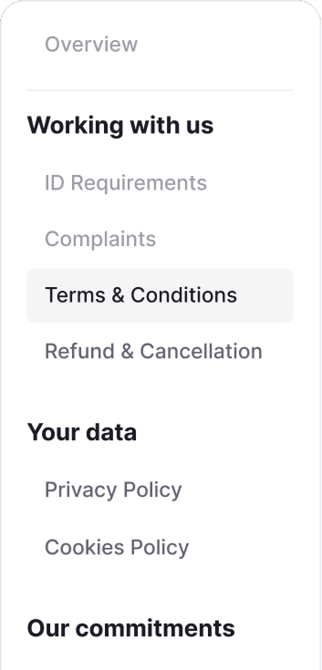
The full grouped set sits on every page with the current document highlighted. The overview is for first-time scanning, the rail for repeat and lateral navigation.

Why a hub, and not just a tidier footer? Because a better footer still fails the user who doesn’t know which document they need. The hub exists for discovery and orientation, and as a side benefit it is a stronger trust and SEO surface.

ACT TWO - THE PROBLEM AT THE SMALLEST STATE

The phone is where the job gets hardest.

The phone is where the job gets hardest.

The phone is where the job gets hardest.

A persistent rail can’t simply shrink onto a 360px screen, and every obvious fix quietly drops one of the three jobs.

A persistent rail can’t simply shrink onto a 360px screen, and every obvious fix quietly drops one of the three jobs.

A persistent rail can’t simply shrink onto a 360px screen, and every obvious fix quietly drops one of the three jobs.

1

A plain hamburger hides orientation. No current document, no group, until you open a menu.

A plain hamburger hides orientation. No current document, no group, until you open a menu.

2

Drill-down menus break browsing. In, back out, in again. The cross-group jump, which is the most common move here, becomes the most expensive one.

Drill-down menus break browsing. In, back out, in again. The cross-group jump, which is the most common move here, becomes the most expensive one.

3

Persistent in-page nav eats the screen. A chip rail or fat breadcrumb competes with the document for the ~555px a small phone has left.

Persistent in-page nav eats the screen. A chip rail or fat breadcrumb competes with the document for the ~555px a small phone has left.

4

Merging site and section nav muddies both. One menu doing ‘move within’ and ‘leave entirely’ makes neither predictable.

Merging site and section nav muddies both. One menu doing ‘move within’ and ‘leave entirely’ makes neither predictable.

EXPLORATION

Three patterns, one winner.

Three patterns, one winner.

Three patterns, one winner.

I ran three credible patterns for the phone side by side and pushed each through the real content. The failures ruled out whole classes of solution and sharpened the brief for the winner.

I ran three credible patterns for the phone side by side and pushed each through the real content. The failures ruled out whole classes of solution and sharpened the brief for the winner.

I ran three credible patterns for the phone side by side and pushed each through the real content. The failures ruled out whole classes of solution and sharpened the brief for the winner.

PATTERN A

PATTERN A

Collapsed disclosure

Collapsed disclosure

Recommended

A summary row shows where you are; tap to expand the full grouped tree. All groups visible at once. ~56px when closed.

A summary row shows where you are; tap to expand the full grouped tree. All groups visible at once. ~56px when closed.

PATTERN B

Sticky breadcrumb

Considered
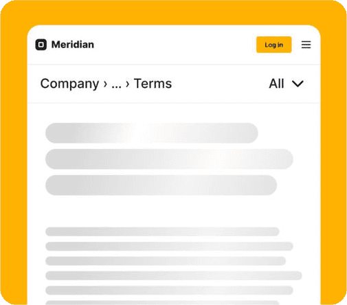
The path tells you where you are, and ‘All’ opens a sheet. Compact, but it loses browsability: the tree is hidden by default, and the path truncates at 360px.

PATTERN C

Chip rail at top

Considered

Sister policies one tap away. But shows only the current group; cross-group jumps need a separate menu. Eats ~80px on every page.

I scored each pattern against the three jobs the navigation has to do, pushed through the real content at 360px. A full mark means it does the job cleanly, a half mark means it does it with a caveat, an empty mark means it fails.

The job

A · Disclosure

B · Breadcrumb

C · Chip rail

Tells you where you are

Current item and group both shown

Path names the location

~

Only the current group for context

Lets you browse the whole set

All groups expand at once

Tree hidden by default

~

Shows the current group only

Cross-group jumps stay one step

Any policy, one tap

~

Via a secondary sheet

Needs a separate menu

Stays light on space

~56px closed

Compact single row

~80px on every page

Holds at 360px

No truncation

Path truncates

~

Chips overflow and scroll

How it scored

5 clean

2 clean, 1 caveat, 2 fail

0 clean, 2 caveat, 3 fail

Disclosure was the only pattern that held all five without a caveat. The breadcrumb and the chip rail each traded away browsability, the one thing my users needed most, since they often arrive unsure which policy they actually want.

Disclosure was the only pattern that held all five without a caveat. The breadcrumb and the chip rail each traded away browsability, the one thing my users needed most, since they often arrive unsure which policy they actually want.

Disclosure was the only pattern that held all five without a caveat. The breadcrumb and the chip rail each traded away browsability, the one thing my users needed most, since they often arrive unsure which policy they actually want.

THE SOLUTION

The rail’s smallest honest state.

The rail’s smallest honest state.

The rail’s smallest honest state.

Pattern A keeps all three jobs at 360px. It is the same rail you saw on desktop, collapsed, doing on a phone exactly what it does on a wide screen.

Pattern A keeps all three jobs at 360px. It is the same rail you saw on desktop, collapsed, doing on a phone exactly what it does on a wide screen.

Pattern A keeps all three jobs at 360px. It is the same rail you saw on desktop, collapsed, doing on a phone exactly what it does on a wide screen.

Desktop - Full rail

Mobile - Closed

Mobile - Section menu open

Closed, the row already tells you where you are. Tap it and the full tree opens inline while the page dims behind it. It is the same component doing the same three jobs, all the way from the desktop rail to the phone.

Orientation comes for free.

Orientation comes for free.

Closed, the row shows the group label above the current document. You can read the hierarchy without a single tap, which is exactly what the desktop rail does.

The whole tree is one tap away.

The whole tree is one tap away.

Tapping anywhere on the row opens the full tree inline and the chevron flips. It is never a hamburger glyph, because the hamburger already means something else. Close it and you land back where you were reading.

Tapping anywhere on the row opens the full tree inline and the chevron flips. It is never a hamburger glyph, because the hamburger already means something else. Close it and you land back where you were reading.

Section and site navigation stay separate.

Section and site navigation stay separate.

The section tree expands inline. The site menu takes over the screen, and the hamburger becomes a close icon. Two gestures for two intents, and the menus never trap you: opening one closes the other.

How I worked. This landed on the roadmap as a footer tidy-up. I reframed it as an IA project and got the PM aligned on treating the eight pages as one system before any pixels. I pressure-tested feasibility with engineers early — part of why the disclosure pattern won is that it reuses existing design-system tokens and ships as one component, with no new engineering primitives or system change. I worked with legal to name the three themes in users' language rather than legal's, and to confirm the "Updated" dates could be sourced reliably. The main trade-off I made was the footer itself: since it's an already-built component, its IA had to stay untouched until phase 2, so I descoped it deliberately rather than half-fix it now.

THE HANDOFF

What the design delivers.

What the design delivers.

What the design delivers.

The redesign is fully specified and handed off for the platform rebuild. Every document gets a home and an address: the hub replaces eight orphaned pages with one oriented set that works on any page, on either platform.

The redesign is fully specified and handed off for the platform rebuild. Every document gets a home and an address: the hub replaces eight orphaned pages with one oriented set that works on any page, on either platform.

~56 px

~56 px

~56 px

The closed footprint of the disclosure, against the chip rail’s permanent ~80px. And it reveals the entire tree on demand, not just the current group.

8 docs - 3 groups

8 docs - 3 groups

8 docs - 3 groups

All visible at once when the tree is expanded, with no drill-down and back-out loop. Cross-group jumps stay one interaction long.

1 component

1 component

1 component

The same navigation, consistent from an 1800px desktop to a 360px phone, reused on both the hub and the individual policy pages.

44 px targets

44 px targets

44 px targets

Minimum touch target throughout, with the active document carrying three redundant cues (border, weight, tag) for low-vision and screen-reader users.

How it was validated

An unmoderated test on the live build, the same three tasks I had run against the old flow:

  • Find a specific policy from a cold start

  • Move from one policy to a related one

  • Get back to where they were reading

What I measured

  • Task success rate

  • Time to locate a document

  • Single Ease Question, 1 to 7

  • How people described the route they took

Each one maps back to one of the three jobs the home has to do.

Result. On the redesign, six of eight participants completed each of the three tasks, a 75% success rate that improves on the old flow. They rated the experience easy overall, averaging 6.6, 5.9 and 5.9 out of 7 for the refund, cookies and privacy tasks. Finding the refund policy cold dropped from around 109 seconds on the old flow to about 47. The contrast in their own words is the clearest signal: the old flow was "scrolled to the footer," "I don't know, click on it"; the redesign was "Side menu," "I found it in the side bar," "I tapped the nav at the top and found it easily." Two participants still stalled, but where four of seven could not find a policy unaided before, the hub makes the whole set findable for most on the first try. Small samples on both sides, reported as counts.

WHAT CAME NEXT

Where the pattern goes next.

Where the pattern goes next.

Where the pattern goes next.

The disclosure is the reusable answer for any deep, grouped area where a desktop rail exists but mobile has nowhere to put it, like Services or the Resource Centre. The closed-state orientation and the inline expansion carry over unchanged.

The disclosure is the reusable answer for any deep, grouped area where a desktop rail exists but mobile has nowhere to put it, like Services or the Resource Centre. The closed-state orientation and the inline expansion carry over unchanged.

I left one question open for testing instead of over-engineering around it. On the smallest phone, the expanded tree runs close to the fold. The spec ships as drawn, and if testing shows people miss the last rows, the fix is small and already scoped. I would rather settle that with evidence than guess at it.

I left one question open for testing instead of over-engineering around it. On the smallest phone, the expanded tree runs close to the fold. The spec ships as drawn, and if testing shows people miss the last rows, the fix is small and already scoped. I would rather settle that with evidence than guess at it.

I design from what content has to do for a user, before deciding what it looks like.

I design from what content has to do for a user, before deciding what it looks like.

Case study mockup - names, logo, colours and registration details anonymised (‘Meridian’). Layout recreated for portfolio use under NDA.

© Featured projects プロジェクト

[W_RXS®]

Case Studies