[
Vodafone
]
Developing a visual language born from code to attract top-tier engineering talent.
Role
Senior Visual Designer (Partnering with Lead)
Scope
Branding, Art Direction, Web
Duration
3 months
SUMMARY
Vodafone is massive, but they needed to shift gears. They wanted to move from being seen as a traditional telco to a serious tech employer.
Working with the Lead Designer, I helped lead a visual overhaul to position Vodafone as a true tech destination. I focused on the “Language of Code” design system, using engineering symbols, fluid patterns, and strict typographic rules. We applied this across web and merchandise to bridge corporate legacy with modern innovation.
The Disconnect
Vodafone faced a credibility gap. While well-known, developers saw it as a legacy utility rather than a tech destination. The corporate aesthetic felt marketing-heavy and disconnected from actual coding. We needed a visual language that felt authentic to builders without alienating the core business.
Visual Strategy
We created 'A Digital Language Born from Code' by deconstructing programming syntax to speak the developer's language. Visually, I pushed the brand into a 'Dark Mode' aesthetic. I blended Vodafone Red with deep purples to mirror the code editors engineers use daily.
The Cultural Shift
We established a new “tribe” within the business. The rebrand did more than look good, it legitimised the engineering department as a core pillar of the organisation.
Operational Efficiency
Cultural Shift
The new identity legitimised the engineering department as a core pillar of the business and supported the recruitment of technical talent.
Future-Proofing
Built an extensible identity ready for emerging platforms, future-proofing the brand for Metaverse integration and beyond.

Uncovering the Logic
We avoided sci-fi clichés like “Matrix” rain. By observing our engineering teams, we saw that programming syntax is visual logic, not just text. High-contrast monospaced fonts and brackets became the foundation of the entire identity.
The Visual Language
Visualising how data moves
Designed to mirror network topology, these dynamic patterns visualise live data exchange between Vodafone and its partners. Functioning as a living system, they communicate connection and flow instantly, without a single line of copy.


The Engineering Spectrum
Anchored by the iconic Vodafone Red, we expanded the corporate palette into a dynamic gradient system. The spectrum extends into deep, tech-forward secondary hues, distinguishing the engineering sub-brand while keeping it clearly part of the family.
Curating the imagery
We defined two photography pillars to balance the abstract nature of code. “Human Connection” highlighted the people behind the tech, while “Abstract Structure” celebrated engineering achievements and modern architecture. Every image was filtered through the brand’s iconic red, making even third-party assets feel proprietary to the new system.


System Rollout
To ensure adoption, the system needed to be practical across digital and physical touchpoints
Practical tools for non-designers
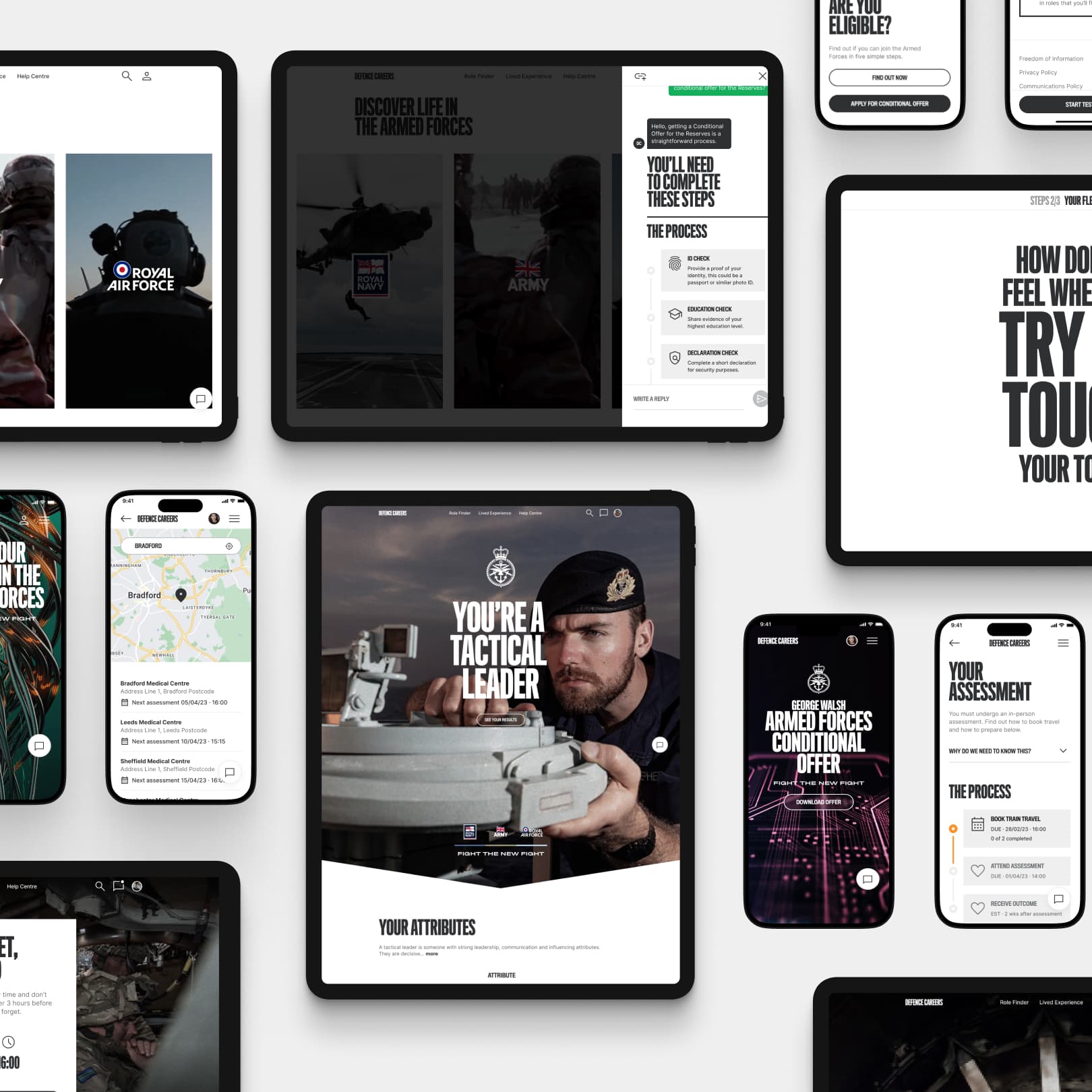
Website Concept Creation
For the careers site, I went dark mode first. Rich backgrounds reduce eye strain and treat the UI like a code editor, making it functional, clean, and comfortable for long sessions.
Swag as a cultural currency
For this audience, swag builds belonging. We treated t-shirts and laptop stickers as cultural touchpoints, not just cheap giveaways.
The Identity Generator
To drive adoption, we created an internal “Identity Compiler.” This tool lets engineers generate code-based profile pictures, literally writing themselves into the system syntax.


CONCLUSION
We didn’t just sell a job, we sold a culture. This project translated a corporate giant into a digital native. By drawing on the visual language of code and Vodafone’s heritage, we created an identity that resonated.
Learnings & Future Improvements
The core learning was that authenticity is essential. This audience can spot marketing fluff instantly. Speaking their language through syntax and structure worked because it was honest. Next, I would explore a live-code brand generator to let teams create their own visuals, strengthening the connection between the brand and its builders.