[
UK Defence Careers
]
Forging a unified recruitment ecosystem for the British Armed Forces.
Role
Senior Visual and Product Designer
Scope
UX/UI, Responsive Website, Motion, UI Kit
Duration
5 months
SUMMARY
I led the product design for the bid that won a £300m MoD contract. To fix a fragmented recruitment process, I designed a single digital ecosystem. The resulting platform unifies the Army, Navy and Royal Air Force and prioritises the candidate experience.
My key contributions:
Strategic Visual Direction: Defined a "harmonising" brand system that unified the three forces while respecting their unique heritage.
Stakeholder Alignment: Facilitated workshops to bridge the gap between distinct service cultures (Army, Navy, RAF), driving consensus on a unified design language.
Experience Design: Led the high-fidelity UI and architectural design for the candidate dashboard and application journey.
Prototyping & Motion: Created advanced motion prototypes to articulate the product vision and secure stakeholder buy-in.
Bid Leadership: Collaborated with senior leadership to define "win themes" that were instrumental in securing the government contract.
The Recruitment Crisis
Joining the Armed Forces is a major life commitment. But the old digital experience was rigid and confusing. Candidates faced long delays and high drop off rates. The separate services caused friction and forced users to repeat paperwork. This poor system pushed away qualified people when the military needed them most.
Approach
Humanising the bureaucracy was the main goal. The design process removed complexity and built a clear interface. Simple typography and plain English turned a difficult government hurdle into a clear user journey.
Outcomes & Impact
I aligned my design outcomes directly with the Ministry of Defence recruitment targets.
Unified Data Architecture
Intelligent Triage Strategy
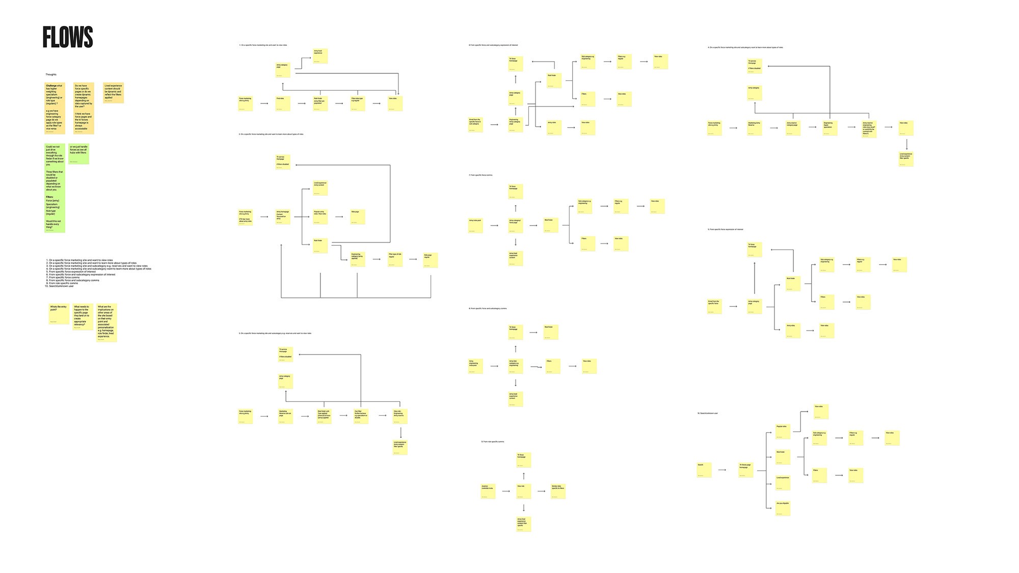
Validated a "Smart Triage" flow through user testing. Analysing skills rather than forcing an immediate branch choice significantly reduced decision fatigue.
Political & Visual Unification
Solved the tri-service equality challenge with a "Neutral Authority" design system. A scalable UI library maintains distinct identities within a unified ecosystem.
Validated Process Transparency
Designed a "Transparent Tracker" to give real-time application visibility. Research confirmed this was the primary driver for reducing candidate anxiety and drop-off.
Deconstructing the Silos
An evidence led approach guided the work. Auditing existing user journeys highlighted the main pain points. This defined the core principles needed to shape a unified Defence identity.
Stakeholder Workshops
Workshops with representatives from all three services uncovered their specific requirements. This process established their unique cultural boundaries.
Global Benchmarking
Benchmarking recruitment platforms from allied nations guided the strategy. Mapping site architectures from Canada, the US and Australia revealed how they structure complex information. This identified the best patterns for guiding candidates through difficult digital journeys.
Visual Strategy & Alignment
Visual direction was the first step in bridging the cultural gap. I used moodboards to illustrate a shared One Defence vision. This secured stakeholder approval for a modern look that respected tradition. Codifying the visual principles into a design library maintained consistency across the ecosystem.
System Design & Architecture
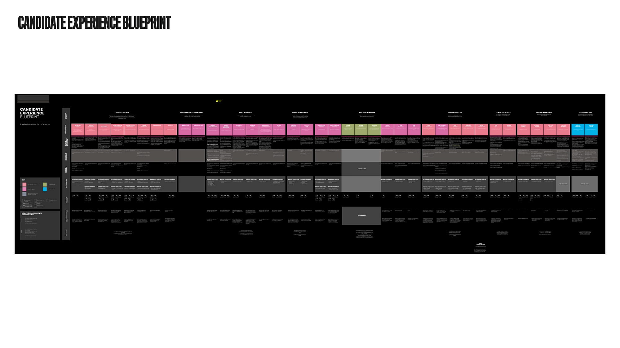
The Candidate Experience Blueprint
This strategic framework maps the full recruitment lifecycle of a UK Defence applicant across a gridded matrix. By visualising stages, actions, emotions, and touchpoints, it highlights friction points and helps optimise the unified process across all three services.
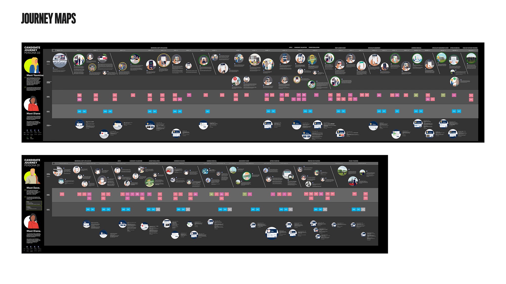
Journey maps
These narrative maps show the end-to-end lifecycle of Army, Navy, and RAF candidate personas. By tracking actions, emotions, and touchpoints from attraction to onboarding, they reveal friction points that guide the design of a unified digital recruitment experience.
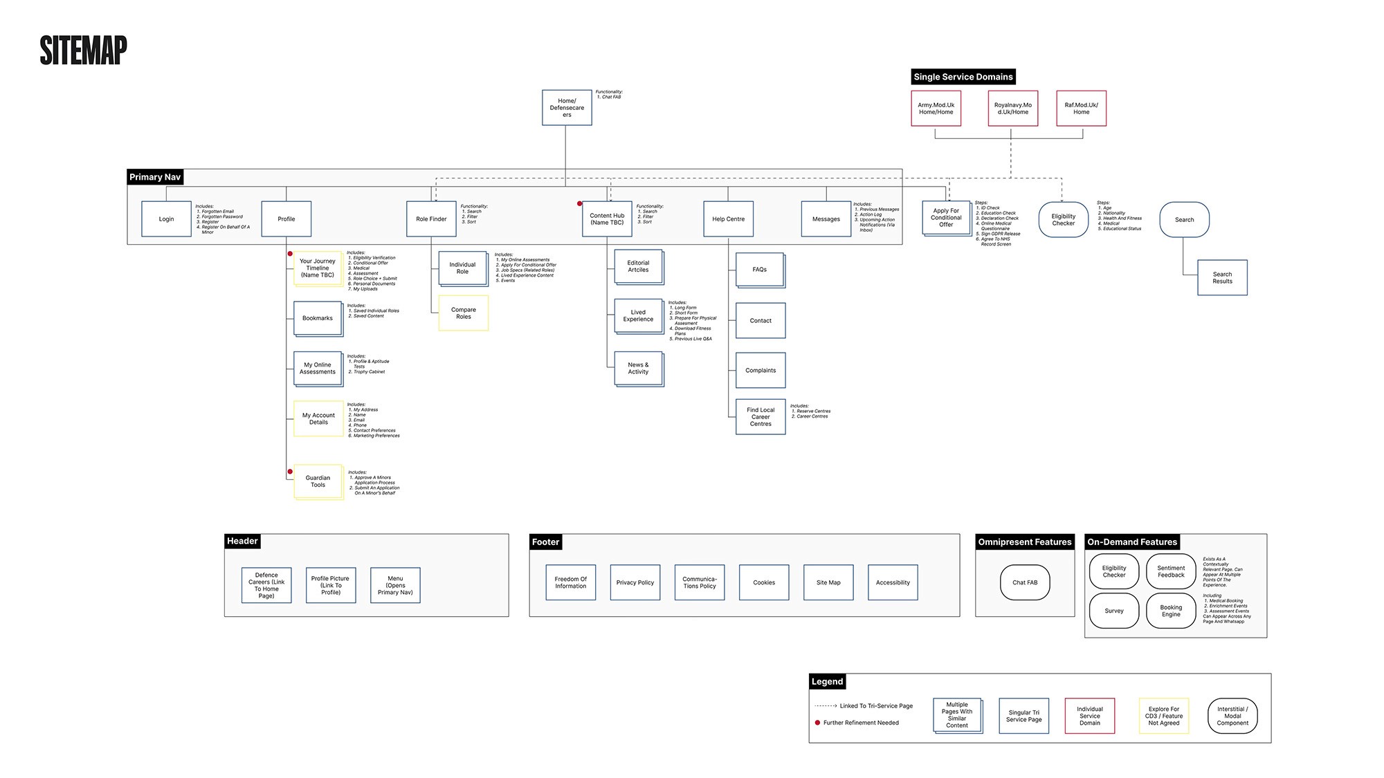
Information Architecture
A unified sitemap consolidated three massive websites into one streamlined portal.
The Diplomacy of Design
The biggest challenge was political. The solution had to remain neutral and favour no single service. Shared typography and layouts created a neutral design system. Colour served only as a navigational guide instead of a brand driver.
Bringing the Vision to Life
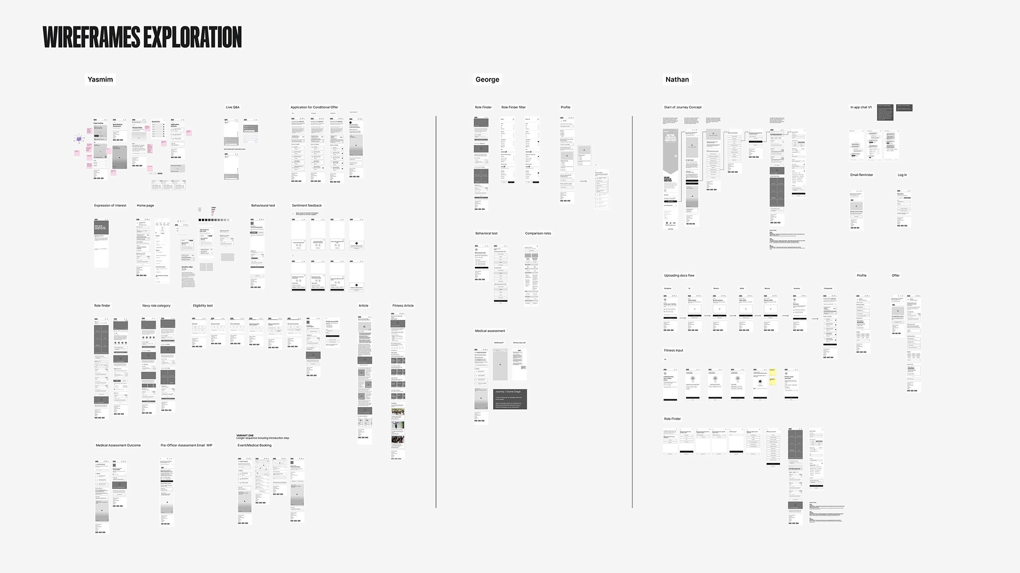
High-Fidelity Mockups
I led the detailed UI design for critical journeys, including the Landing Page, Role Finder, and the comprehensive Candidate Dashboard.
Motion UI
Motion was used as a functional guide, not decoration. For example, smooth transitions between “Army” and “Navy” modes alerted users to context changes without jarring page reloads.
Scalable Design Systems
I delivered a comprehensive UI kit and component library that enables future design teams to maintain consistency across the entire Defence estate.
UI Kit and component library
Standards & Localisation
The GDS Challenge
Balancing the Ministry of Defence desire for a premium look with strict government constraints was crucial. Pushing visual boundaries still maintained full accessibility compliance.
Content Strategy & Localisation
Testing language with civilian user groups ensured military terminology was replaced with plain English. Service specific terms only appeared as candidates progressed further down the funnel.
IMPACT & LEGACY
This project delivered more than a visual redesign. It established a blueprint to modernise recruitment culture. A historic institution shifted from a fractured internal focus to a unified system.
Retrospective & Roadmap
My biggest learning was navigating the “Tribal Paradox,” balancing a unified system with the strong pride of each service. Moving forward, the roadmap should embrace “purposeful friction”. Introducing gamified assessments earlier helps filter for commitment, shifting the focus from application volume to the quality of hire.

